Show the code
pacman::p_load(scales, viridis, lubridate, ggthemes,
               gridExtra, readxl, knitr, data.table,
CGPfunctions, ggHoriPlot, tidyverse)Visualising and Analysing Time-oriented Data
By the end of this hands-on exercise you will be able create the followings data visualisation by using R packages:
plotting a calender heatmap by using ggplot2 functions,
plotting a cycle plot by using ggplot2 function,
plotting a slopegraph
plotting a horizon chart
pacman::p_load(scales, viridis, lubridate, ggthemes,
gridExtra, readxl, knitr, data.table,
CGPfunctions, ggHoriPlot, tidyverse)For the purpose of this hands-on exercise, eventlog.csv file will be used. This data file consists of 199,999 rows of time-series cyber attack records by country.
First, you will use the code chunk below to import eventlog.csv file into R environment and called the data frame as attacks.
attacks <- read_csv("data/eventlog.csv")In this section, we will learn how to plot a calender heatmap programmatically by using ggplot2 package.
Our goals for this chapter:
Before starting the data prepration would be wise for us to understand our data first before further analysis performed
There are three columns, namely timestamp, source_country and tz.
timestamp field stores date-time values in POSIXct format.
source_country field stores the source of the attack. It is in ISO 3166-1 alpha-2 country code.
tz field stores time zone of the source IP address.
For timezone, the title tz might be confusing for certain type of analysis, so if it is needed, it is suggested to rename the title
Below we will use kable() to review the structure of the imported data frame
kable(head(attacks))| timestamp | source_country | tz |
|---|---|---|
| 2015-03-12 15:59:16 | CN | Asia/Shanghai |
| 2015-03-12 16:00:48 | FR | Europe/Paris |
| 2015-03-12 16:02:26 | CN | Asia/Shanghai |
| 2015-03-12 16:02:38 | US | America/Chicago |
| 2015-03-12 16:03:22 | CN | Asia/Shanghai |
| 2015-03-12 16:03:45 | CN | Asia/Shanghai |
Before we can plot the calender heatmap, two new fields namely wkday and hour need to be derived. In this step, we will write a function to perform the task.
make_hr_wkday <- function(ts, sc, tz) {
  real_time <- ymd_hms(ts,
                       tz = tz[1],
                       quiet = TRUE)
  dt <- data.table(source_country = sc,
                   wkday = weekdays(real_time),
                   hour = hour(real_time))
  return(dt)
}
Understand the Code
This function accepts three parameters: ts (timestamp), sc (source country), and tz (timezone). It utilizes the ymd_hms()function from the lubridate package to parse the input timestamp string (ts) into a date-time object. Crucially, it assigns the timezone specified by the first element of the tz parameter (e.g., tz[1]) to this parsed date. Following this, the function leverages the data.table package, known for its optimized speed and memory efficiency, especially with large datasets, to construct a new data table named dt. This dt object will contain three columns: source_country, wkday(representing the day of the week), and hour (representing the hour of the day).
ymd_hms() and hour() are from lubridate package, andweekdays() is a base R function.wkday_levels <- c('Saturday', 'Friday',
'Thursday', 'Wednesday',
'Tuesday', 'Monday',
'Sunday')
attacks <- attacks %>%
group_by(tz) %>%
do(make_hr_wkday(.$timestamp,
.$source_country,
.$tz)) %>%
ungroup() %>%
mutate(wkday = factor(
wkday, levels = wkday_levels),
hour = factor(
hour, levels = 0:23))Beside extracting the necessary data into attacks data frame, mutate() of dplyr package is used to convert wkday and hour fields into factor so they’ll be ordered when plotting
Table below shows the tidy tibble table after processing.
kable(head(attacks))| tz | source_country | wkday | hour |
|---|---|---|---|
| Africa/Cairo | BG | Saturday | 20 |
| Africa/Cairo | TW | Sunday | 6 |
| Africa/Cairo | TW | Sunday | 8 |
| Africa/Cairo | CN | Sunday | 11 |
| Africa/Cairo | US | Sunday | 15 |
| Africa/Cairo | CA | Monday | 11 |
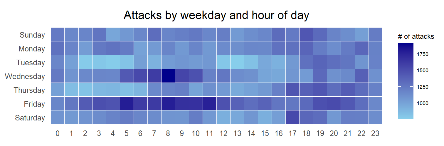
grouped <- attacks %>%
  count(wkday, hour) %>%
  ungroup() %>%
  na.omit()

ggplot(grouped,
       aes(hour,
           wkday,
           fill = n)) +
geom_tile(color = "white",
          size = 0.1) +
theme_tufte(base_family = "Helvetica") +
coord_equal() +
scale_fill_gradient(name = "# of attacks",
                    low = "sky blue",
                    high = "dark blue") +
labs(x = NULL,
     y = NULL,
     title = "Attacks by weekday and time of day") +
theme(axis.ticks = element_blank(),
      plot.title = element_text(hjust = 0.5),
      legend.title = element_text(size = 8),
      legend.text = element_text(size = 6) )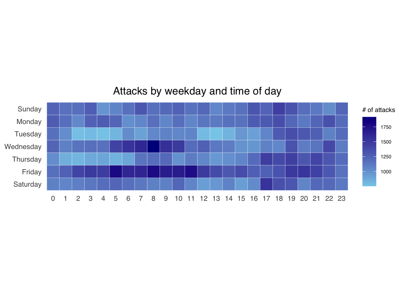
group_by() and count() functions.na.omit() is used to exclude missing value.geom_tile() is used to plot tiles (grids) at each x and y position. color and size arguments are used to specify the border color and line size of the tiles.theme_tufte() of ggthemes package is used to remove unnecessary chart junk. To learn which visual components of default ggplot2 have been excluded, you are encouraged to comment out this line to examine the default plot.coord_equal() is used to ensure the plot will have an aspect ratio of 1:1.scale_fill_gradient() function is used to creates a two colour gradient (low-high).Then we can simply group the count by hour and wkday and plot it, since we know that we have values for every combination there’s no need to further preprocess the data.
Challenge: Building multiple heatmaps for the top four countries with the highest number of attacks.
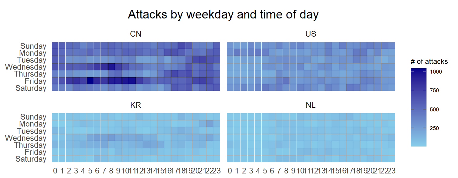
Pay attention that this the x label of the 2 graph KR and NL is not properly present. This will require further arrangement for visual representation.
Step 1: Deriving attack by country object
In order to identify the top 4 countries with the highest number of attacks, you are required to do the followings:
attacks_by_country <- count(
  attacks, source_country) %>%
  mutate(percent = percent(n/sum(n))) %>%
  arrange(desc(n))
Step 2: Preparing the tidy data frame
In this step, you are required to extract the attack records of the top 4 countries from attacksdata frame and save the data in a new tibble data frame (i.e. top4_attacks).
top4 <- attacks_by_country$source_country[1:4]
top4_attacks <- attacks %>%
  filter(source_country %in% top4) %>%
  count(source_country, wkday, hour) %>%
  ungroup() %>%
  mutate(source_country = factor(
    source_country, levels = top4)) %>%
na.omit()Step 3: Plotting the Multiple Calender Heatmap by using ggplot2 package.
ggplot(top4_attacks,
       aes(hour,
           wkday,
           fill = n)) +
  geom_tile(color = "white",
          size = 0.1) +
  theme_tufte(base_family = "Helvetica") +
  coord_equal() +
  scale_fill_gradient(name = "# of attacks",
                    low = "sky blue",
                    high = "dark blue") +
  facet_wrap(~source_country, ncol = 2) +
  labs(x = NULL, y = NULL,
     title = "Attacks on top 4 countries by weekday and time of day") +
  theme(axis.ticks = element_blank(),
        axis.text.x = element_text(size = 7),
        plot.title = element_text(hjust = 0.5),
        legend.title = element_text(size = 8),
        legend.text = element_text(size = 6) )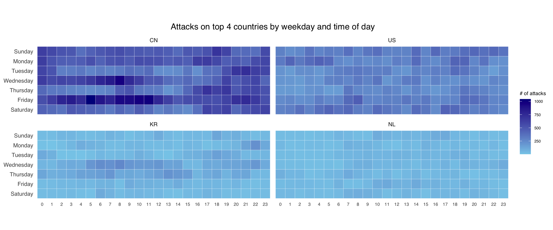
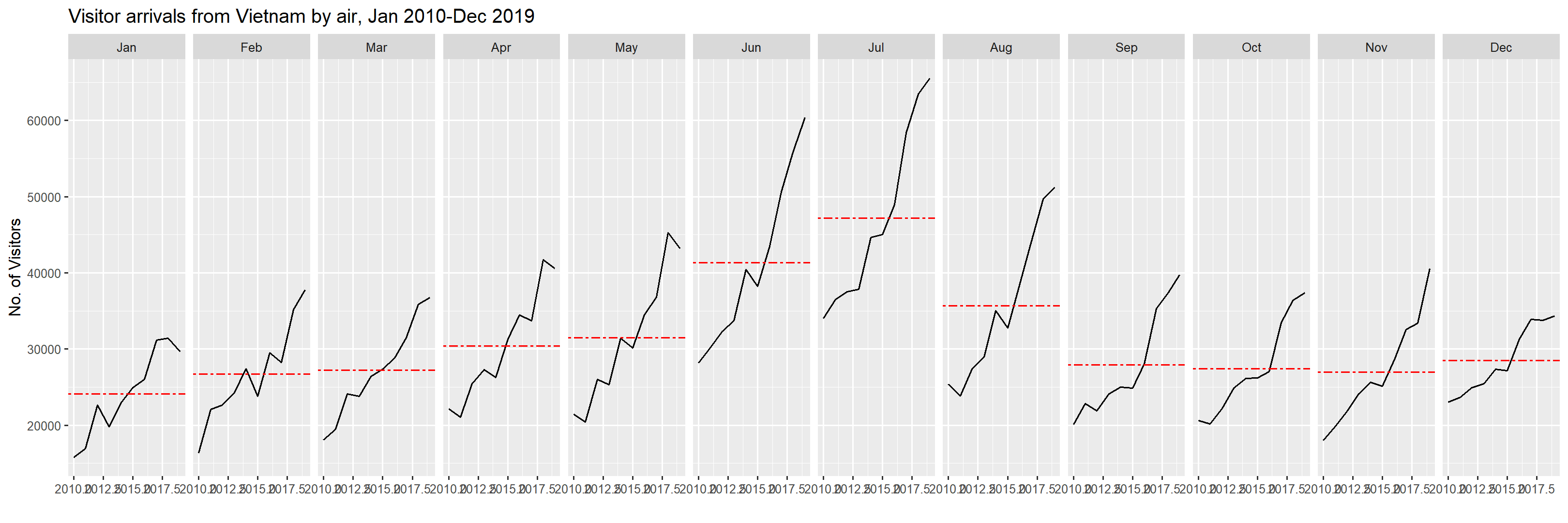
In this section, you will learn how to plot a cycle plot showing the time-series patterns and trend of visitor arrivals from Vietnam programmatically by using ggplot2 functions.
For the purpose of this hands-on exercise, arrivals_by_air.xlsx will be used.
The code chunk below imports arrivals_by_air.xlsx by using read_excel() of readxl package and save it as a tibble data frame called air.
air <- read_excel("data/arrivals_by_air.xlsx")Next, two new fields called month and year are derived from Month-Year field.
air$month <- factor(month(air$`Month-Year`),
                    levels=1:12,
                    labels=month.abb,
                    ordered=TRUE)

air$year <- year(ymd(air$`Month-Year`))Next, the code chunk below is use to extract data for the target country (i.e. Vietnam)
Vietnam <- air %>%
  select(`Vietnam`,
         month,
         year) %>%
filter(year >= 2010)The code chunk below uses group_by() and summarise() of dplyr to compute year average arrivals by month.
hline.data <- Vietnam %>%
  group_by(month) %>%
summarise(avgvalue = mean(`Vietnam`))The code chunk below is used to plot the cycle plot as shown in Slide 12/23.
Vietnam# A tibble: 120 × 3
Vietnam month year
<dbl> <ord> <int>
1 15781 Jan 2010
2 16335 Feb 2010
3 18061 Mar 2010
4 22154 Apr 2010
5 21461 May 2010
6 28146 Jun 2010
7 34020 Jul 2010
8 25351 Aug 2010
9 20105 Sep 2010
10 20591 Oct 2010
# ℹ 110 more rowsggplot() +
geom_line(data=Vietnam,
aes(x=year,
y=`Vietnam`,
group=month),
colour="black") +
geom_hline(aes(yintercept=avgvalue),
data=hline.data,
linetype=6,
colour="red",
size=0.5) +
facet_grid(~month) +
labs(title = "Visitor arrivals from Vietnam by air, Jan 2010-Dec 2019") +
xlab("") +
ylab("No. of Visitors") +
scale_x_continuous(breaks = seq(2010, 2019, by = 1)) +
theme (axis.text.x = element_text(angle = 45, hjust = 1, size = 5))
In this section we will learn how to plot a slopegraph by using R.
Before getting start, make sure that CGPfunctions has been installed and loaded onto R environment. Then, refer to Using newggslopegraph to learn more about the function. Lastly, read more about newggslopegraph() and its arguments by referring to this link.
Import the rice data set into R environment by using the code chunk below.
rice <- read_csv("data/rice.csv")Next, code chunk below will be used to plot a basic slopegraph as shown below.
rice %>%
  mutate(Year = factor(Year)) %>%
  filter(Year %in% c(1961, 1980)) %>%
  newggslopegraph(Year, Yield, Country,
                Title = "Rice Yield of Top 11 Asian Counties",
                SubTitle = "1961-1980",
                Caption = "Prepared by: Patricia Trisno")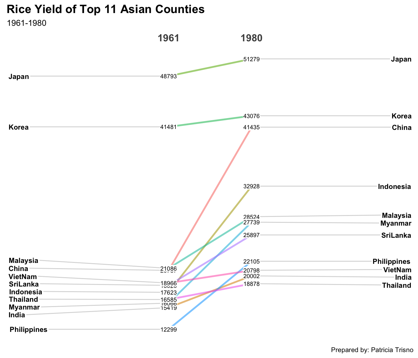
For effective data visualisation design, factor() is used convert the value type of Year field from numeric to factor.